Diagram
Rebranding the Family Business
The Challenge
WSOL was a family-owned web shop with a giant heart and bit of a branding problem. After 25 years of being in business, the company had grown. More people. More offerings. New leadership. Bigger and better projects all the time. And a name no one knew how to say.
THE SOLUTION
Together, we workshopped a fresh brand strategy and new name. We equipped our dear client with all the tools they’d need to take ownership of their (truly wonderful) story and step boldly into their bright future. Hello world. Meet Diagram.
VISUALIZING BRAND VALUES
We took a deeply collaborative and interactive approach to articulating the what, how and why behind the business. What set WSOL apart from the competition was their cheerful blend of playful authority and strategic risk-taking, their all-around approachable cool, tech savvy and of course, the good time family feeling.

BRAND IDENTITY: A COLLABORATIVE SPARK
After brainstorming hundreds of potential names, Diagram emerged the clear winner. A diagram conveys information. “Its purpose is to show the simplest and most fitting solution to a problem.” Perfect for a company committed to stellar client service and efficient solutions. And it just so happened the new name had design legs for days.
A diagram conveys information. Its purpose is to show the simplest and most fitting solution to a problem.


Primary Logo
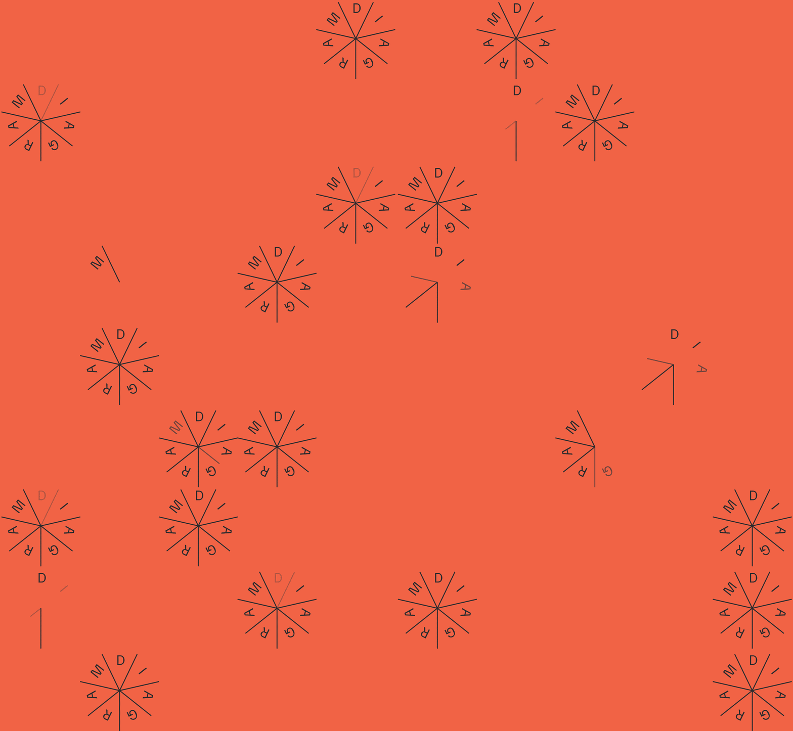
Emotive, connective and scalable, the new logo references the spark of innovation — the moment where collaboration and process give way to brilliance. Intersecting lines show different ideas and perspectives coming together in a strong, unified whole.


Secondary Logo
A more straightforward read on the spark and logotype keeps the strong connection while building brand awareness.

BRAND EXPRESSION
With the name and identity finalized, we got to work helping Diagram launch their new brand. The Diagram identity system was designed to be not only flexible, but fun. Cards, notebooks, totes, an oh-so-cozy hoodie, campfire mugs, a step and repeat, even a custom beer can label done in collaboration with Solemn Oath (a Diagram client and neighbor!). This was one for the books.


Take One, Pass It On
Double-thick, uncoated and duplexed cards gave cost-effective digital printing a chance to feel extra special. Added plus: Diagrammers felt extra special too.


WEBSITE DESIGN: SPRINT TO THE FINISH
We timed the new site and brand launch to coincide with an upcoming conference — smart! That gave us two months to redesign the site. Luckily, Diagram’s top-notch dev team stepped all the way up. Together, we turned sketch-level wires into a fully functional website within 9 weeks. Come launch day, we joined our dear Diagrammers at the Hotel Indigo for a most festive occasion. We hugged, we high fived and some of us cried. Another mountain scaled. Another lesson learned. The best — and only — way forward is together.
“From day one, the collaborative process of discovery, ideation and creation was a smooth and productive group effort. Firebelly’s ability to uncover and explore details about who we are and what we’re really about was a critical part of the successful outcome. Today, we finally feel like our brand truly represents us and we’re excited to introduce it to the world.”
“Partnering with Firebelly for our rebranding initiative was one of the best business decisions we’ve ever made.”
— Bill Casey CEO, Partner


