
Planned Parenthood
A Brand Guide with a Bright Vision
Planned Parenthood has labored fiercely for women’s rights and bodily autonomy for 100+ years. With constituents all over these united states, it has formed an organized front in the ongoing fight for health equity and reproductive justice.
So when Planned Parenthood’s creative team reached out to us for help creating a new brand book, we were thrilled to be of service.
Part manifesto, part style guide (and all heart), the book reflects months of rigorous, hands-on consideration. Together, we developed clear rules, scrutinized every word, every image, and checked our own blind spots along the way.

Brand Values, Voice + Tone
After a thorough brief on the brand’s history and inner workings, we began crafting the foundation, articulating Planned Parenthood’s vision and values. Given the political climate, it was critical that we elevate the organization’s commitment to equity, inclusion and radical empathy while reaffirming its expertise and take-no-guff attitude. And if we could do all that with a colorful flourish, maybe even a hint of joy and unflinching optimism? All the better.

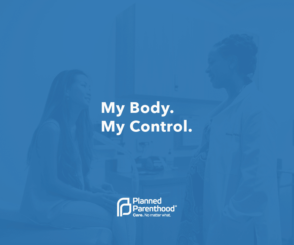
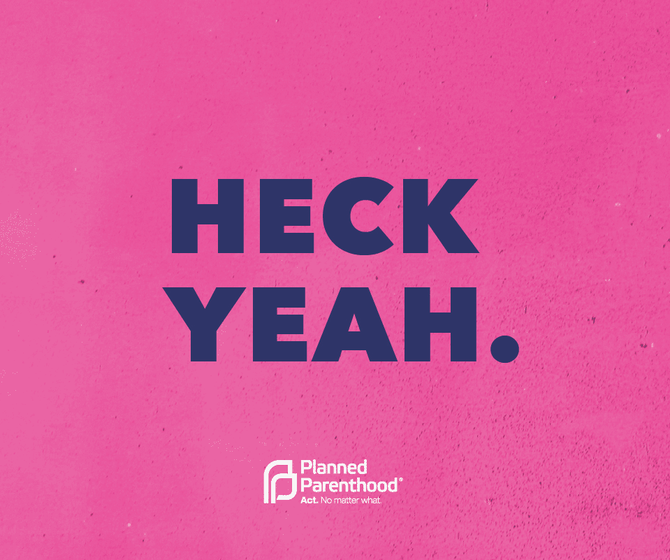
Next, we refined the Planned Parenthood voice — a tricky endeavor given that the organization oversees two discrete arms, health care and advocacy, each with distinct aims and audiences. We had to be conscientious when it came to expressing that voice in different contexts. In addition to offering tonal guardrails for each, we established firm rules for type, color and imagery to differentiate health care communications from advocacy.


Type, Color & Imagery
Accessibility and clarity were key. After all, everyone from internal designers to care center employees would be using the book to create branded materials.
Rather than introduce new assets, we identified fonts and colors already in play, then simplified and standardized from there. The primary typeface, Avenir Next, is not only modern and approachable, it’s available at a range of weights and styles so that folks on the health care side could strike a firm, yet friendly tone while those in advocacy could command attention with heavy caps.

Given the opportunity to tackle Planned Parenthood’s palette, we knew better than to mess with its iconic Action Pink (okay, we adjusted the CMYK value the tiniest bit to optimize digital appeal). But we did elevate the use of deep navy, for added sophistication and emotional impact. We also streamlined throughout and demonstrated how to maintain healthy balance and positive associations.


Keeping in line with the positive vibes, we developed style guidelines and Photoshop scripts to turn any image into a moment. Planned Parenthood has a robust photo archive, if you can believe it; to take full advantage of it, we created a few simple, high impact treatments featuring duotones and double exposures.


Icons + Graphics
Finally, we took on system graphics, determined to make sure that every single icon and visual accent was useful and easily understood. Again, we distilled the existing system down to its most functional, meaningful parts, eliminating confusing icons and creating a suite of minimalist framing devices for a quick dash of character. The idea was to ensure that anyone, no matter their title or design experience, could confidently, colorfully communicate on behalf of the brand and ensure its integrity from one piece to the next.

The user-friendly guide reflects the best of Planned Parenthood: its steadfast dedication to truth and justice, and the power and poise of the people behind it. It captures a vibrant vision for a better world, where every person can be who they are, love who they love and get the care they need. No matter what.


