
Lubeznik
Center for the Arts
The Lubeznik Center for the Arts is our 2020 Grant for Good recipient. We partnered throughout the year to develop a comprehensive update, including a brand strategy, visual identity system, communication tools and website redesign.
The hidden gem in Michigan City, Indiana, is a world-class cultural hub that brings the local community together through eclectic programming and exhibits that foster meaningful connections—from poetry slams to educational programming. We knew early on that the visual identity needed to express as much personality as the center itself.
A Bold Brand Identity


Logo and Custom Font
Much like an experience at LCA, the logo comes in many flavors — from formal to playful. The primary logotype sits comfortably on the formal end. Its pared back vibe is perfect for donor events and world-class art exhibits. The bolder, more playful variation is just right for youth programming, classes and vibrant community activities. When animating across the full spectrum, the center’s full personality springs to life.
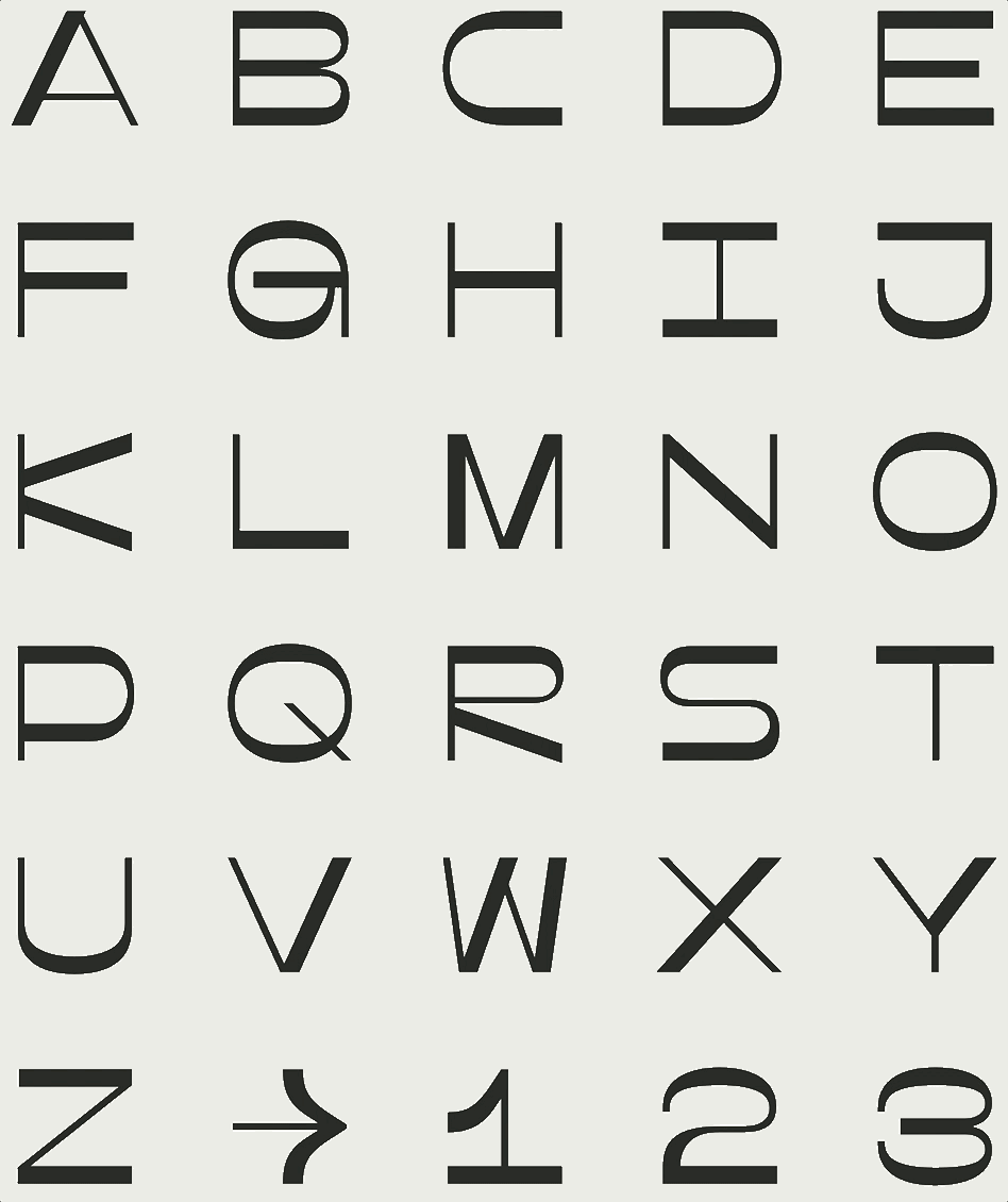
The custom alphabet reflects the architecture and character of the center. Each letter is built within a square, allowing geometry to become a core visual component of the Lubeznik brand. The letters are a monospaced, reverse-contrast, variable sans-serif and enable dynamic animations between the formal and playful states. The boldest abstractions of the letterforms become graphic frames that crop and focus content in layout.


Brand Guidelines
Much more than a set of rules, the brand guide for Lubeznik is a flexible kit of parts that enables their team to confidently make the new system truly their own — from custom patterns to photography treatments. We prioritize usability and sustainability for all our clients, and our Grant for Good partners are no exception.


Website
The website provided endless opportunities for our designers and developers to play with visual and technical details. The interactive platform provides a clear entry point to learn more about the LCA. Dramatic floods of color shift as users scroll through content, and lightly playful animations are cued on rollover to highlight the delightful variety of artwork and programs.


Exterior
During the course of this project a question continued to surface: What will the future of physical interactions look like post-pandemic? The galleries were off limits to the public during our collaboration, but we worked together to develop tools and laid a thoughtful foundation for safely organizing and announcing future visits to the dynamic space.


IMPACT
“You’ve catapulted us forward during a year when things have been so unsure. We are all truly grateful.”
— Rod Lubeznik
“We’re overwhelmed with your generosity. We never could have imagined the time and depth you were able to provide us.”
— Janet Bloch
“My professional practice has changed so much over the course of this year. But this… this has been a touchstone and a North Star. This isn’t just design services, this is a transformational process that started way back for us with a change in structure and ideas years ago. You all have been able to take that all in and it has now been reflected outward.”