
Rockefeller Philanthropy Advisors
Introducing Collaborative for Gender and Reproductive Equity
When Rockefeller Philanthropy Advisors came to us in 2019 with their vision for a new philanthropic collaborative fighting for gender and reproductive equity and focused on low-income women, women of color, and trans and gender non-conforming people—and intending to raise $100 million annually—we knew we had to be part of their mission.
Working closely with their team, we set out to distinguish Collaborative for Gender and Reproductive Equity (CGRE) as a bold new voice in an already established philanthropic landscape. The outcome? A thoughtful new name, compelling visual identity and user-friendly website that clearly articulates both their tremendous offering and deep humanity.
Research, Discovery and Naming
Exhaustive research, which included one-on-one interviews with grantees and organizers on the ground, revealed both excitement and cautious skepticism around the new organization’s potential. We learned that we’d need to prioritize transparency and clarity in order to gain trust. The new name embodies both.

From there, we developed a brand strategy that elevates the collaborative’s courageous and intentional spirit, laying down the foundation for a strong visual expression.

Visual Identity
Inspired by the new descriptive name, we created a bold, condensed and responsive wordmark that highlights its most meaningful words. An additional set of configurations can respond to any layout needs and reflects CGRE’s adaptability.

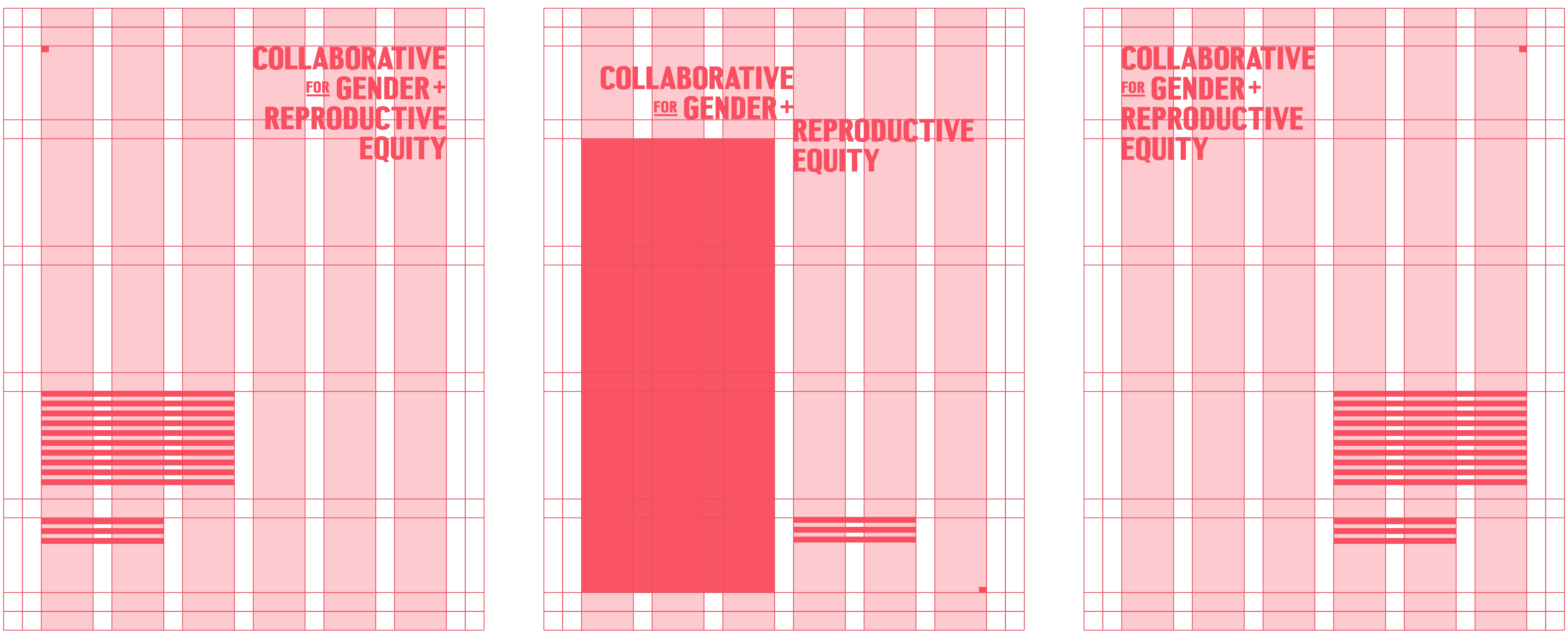
We extracted a subtle graphic element from the wordmark to create a layout device that highlights moments of hope and self-determination. It is simple yet memorable, and underpins the versatility and scalability of the whole system.


Our next step? A brand guide, complete with best practices for designing print and digital assets. The comprehensive toolkit ensures that both internal and external team members can easily generate consistent and compelling communications.
Website
For the website, we made intentional use of the vibrant, balanced color palette throughout. While the homepage is anchored by the fiery coral red and calm, hopeful teal, the supportive pages rely on the friendly softer hues.

True to CGRE, the website reflects a sturdy simplicity that prioritizes transparency and approachability. High-traffic UX features like the navigation are simple and understated, while linear patterns ground text and imagery.


Collateral + Donor Materials
We elevated familiar print materials to provide something special for funder or partner leave-behinds, while a custom pocket folder subtly introduces the brand with quiet confidence.


Donor engagement materials showcase the full spectrum of color pairings and showcase opportunities to energize content-heavy pieces.


The Collaborative takes their mission very personally so we found ways to introduce elements of personalization in small but meaningful ways. A set of multi-colored business cards gives team members a chance to express their personality.

“Highly talented and just plain fun, Firebelly Design is a one-stop-shop that produces outstanding work.”
“Firebelly’s communication, listening and facilitation skills lead us to a new name, website and brand materials that exceeded expectations. Partnering with them is an absolute joy.”
— The CGRE Team