
Chicago Market
Fresh Market, Fresh Identity
If you want to eat clean, there's no shortage of high-end fresh markets that will gladly take your whole paycheck.
The founders of Chicago Market saw the rising demand for sustainable, healthy and affordable food. They also recognized a largely unmet need for a market as committed to local farmers and communities as it is to high quality offerings.
And thus, the idea for Chicago Market was born—a place for community members, not just consumers. A mecca for health nuts and foodies. A safe space where the veggie-averse and beginning cooks could find guidance and education, where local dollars stay local, making Chicago stronger.


NAME, BRAND & STATIONERY
Our first task: find a name. We dove straight into research, surveying Chicagoans from many backgrounds and neighborhoods to get a sense of their values and priorities when it comes where they shop and why.
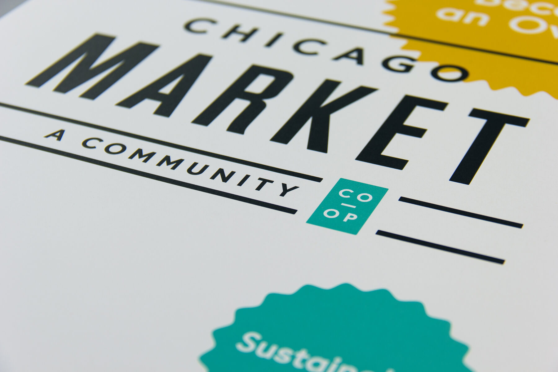
Chicago is not a flashy city. We prefer simplicity over pomp and pretension. Landlocked here in the Midwest, we crave a sense of belonging, like we’re all in this together. We tested several naming options and quickly found a winner: Chicago Market: A Community Co-op.
With a name and values defined, we began building a comprehensive identity system, pairing a crisp, primary color palette with familiar symbols like hand-applied seals and emblems.
“The identity system utilized a primary color palette, familiar symbols, emblems and seals to evoke honesty, humanity and health.”


WEBSITE
With the market coming together, the next focus was on recruiting members. We designed a full stationery system, print collateral and a shiny new website to educate and engage the public.
Vibrant and dynamic, with subtle animations and vivid, colorful photography (taken by one of the co-op’s board members!) throughout, the site allows visitors to join the co-op from any section on any page. It’s built for transaction, without sacrificing surprise or delight.


IMPACT & UPDATES
-
100
Days to surpass original membership goal